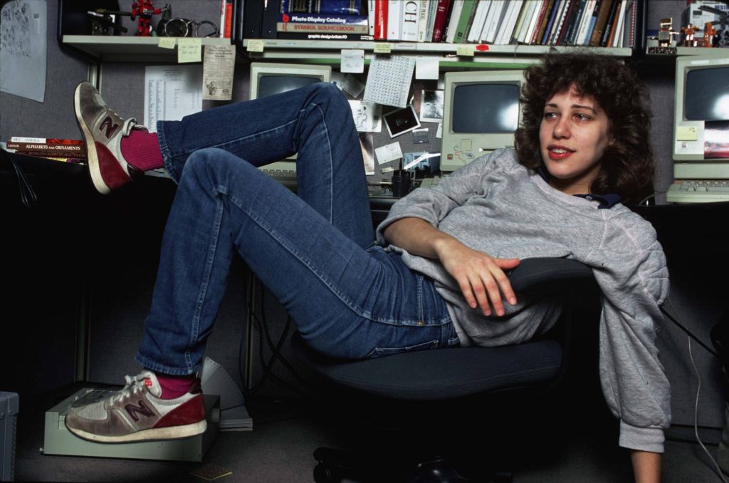
Susan Kare is part of Apple’s history. The icons and typeface that she designed for Macintosh not only shaped the brand’s personality, but have also served as an inspiration for many graphic designers and, 30 years later, her interface elements are still being used on all kind of devices.
Kare studied fine arts. However, in 1982 her friend Andy Hertzfeld, who was working at Apple, offered her a deal: in exchange for an Apple II computer, she would draw icons and other interface elements for the first Macintosh computer.
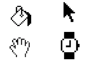
She took up the challenge and dedicated herself to develop a visual language that even today is recognized and used by millions of people around the world: the famous icons.
Inspired by the sewing needles used for her mother’s crafts, and especially by tiny embroidery, she worked on gridded sheets and began to design elements that were recognizable.
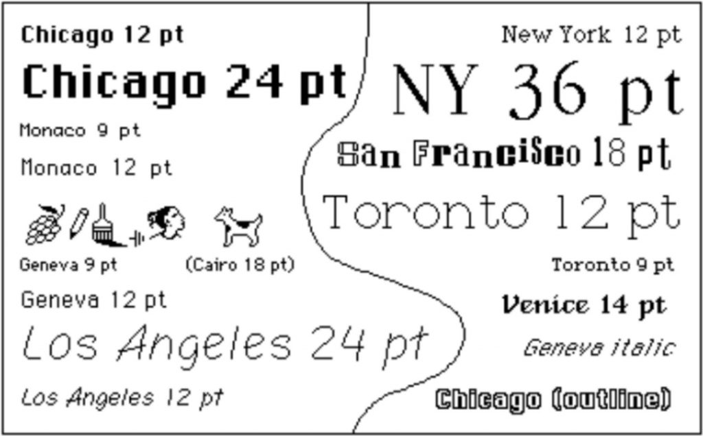
Another challenge Kare faced was designing the first non-monospaced typefaces for a computer. It wasn’t an easy task. Not only was a computer interface an unfamiliar environment to Kare, but also she didn’t have any experience in font design.
She proved to be created fonts that set the tone for generations to come: Chicago, Geneva, New York, or San Francisco.

Susan has been a creative director for NeXT and has received numerous industry awards.
So now you know, each time you click on an app’s paint bucket or lasso icons, keep in mind that those icons were designed by Susan Kare, a woman who broke down preconceptions.